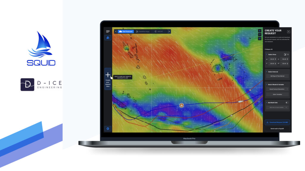
SQUIDX | D-ICE ENGINEERING
UX RESEARCH | UX DESIGN | UI DESIGN | USABILITY TEST | KEY TAKEAWAYS
PLATFORM –SaaS Application
FUNCTION – UX/UI Designer
TIMING – 15 days
TOOLS – Figma, Jira

Project Overview
This case study explores how UX improvements were made to SquidX’s SaaS application to address usability challenges in forecast download and weather routing features. The focus is on optimising the existing interface to reduce pain points, streamline workflows, and create a more intuitive experience for Skippers in the offshore racing market.
Target Users
The primary audience for SquidX includes skippers in the offshore racing market. These users rely on accurate weather forecasts and efficient routing tools to make critical decisions during their races, often under time-sensitive and high-pressure conditions.
Scope
Forecast Download: Optimising the process for selecting and downloading weather forecasts.
Weather Routing: Enhancing the workflow for setting up and analysing weather-based routing scenarios.
Design Process

1. Identify Issues
Key Pain Points & Usability Challenges
The existing SquidX interface presents several usability challenges for offshore skippers, including:
1. Complex Workflow
The forecast download request process is difficult to navigate. It lacks a clear starting point, making it challenging for users—especially first-time users—to understand where to begin and what to do next.
2. Lack of Tooltips
The current design does not provide tooltips, which could assist both first-time and advanced users by offering brief, contextual explanations or instructions when they hover over or interact with key elements. Without tooltips, users may struggle to understand the purpose of certain actions or fields, leading to confusion or inefficiency, even for more experienced users who may need quick reminders.
3. Map Interaction Challenges
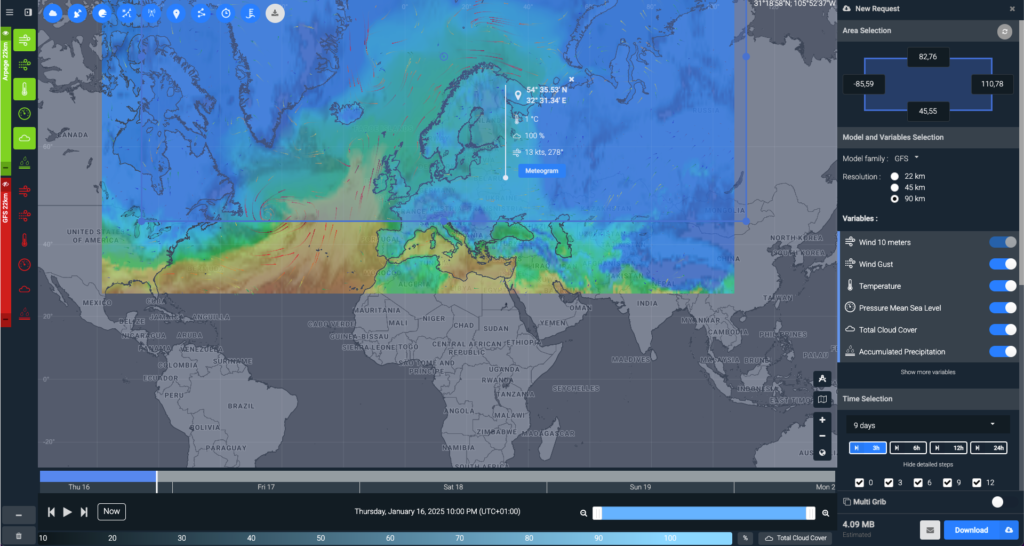
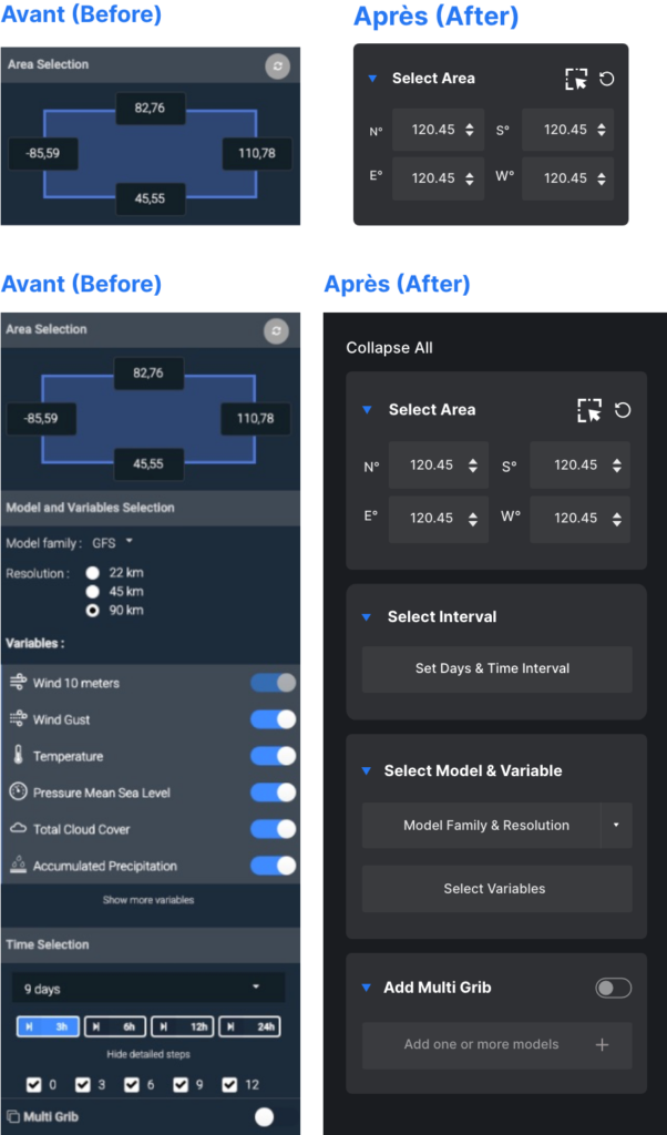
- Selecting areas on the map is unintuitive, as users must drag an existing default selection instead of being able to create a new one easily.
- There is no dedicated “Select Area” button, and the interaction requires unnecessary effort to adjust the pre-set region.
4. Uncategorized Variable Selection
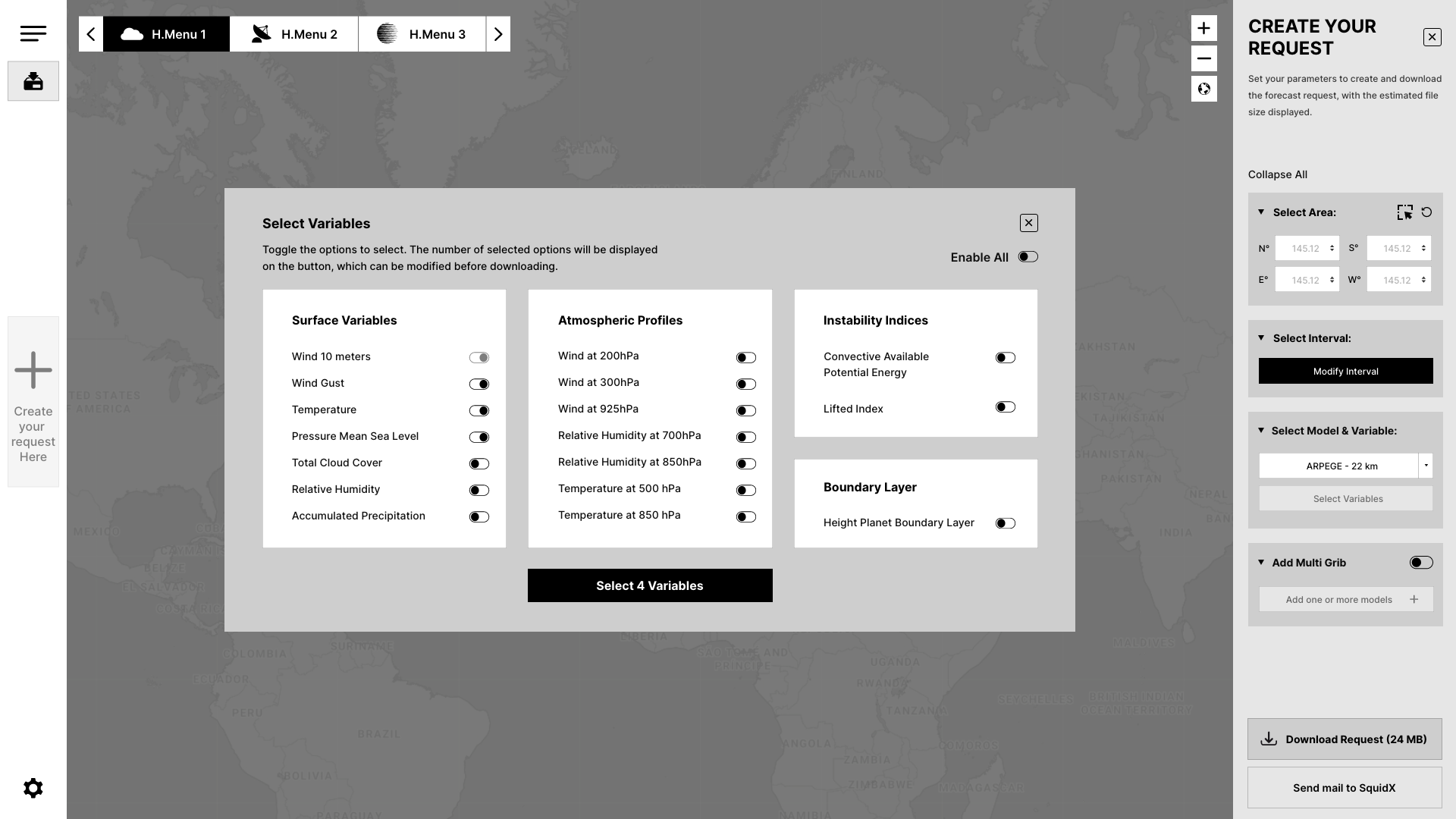
Variable options are listed without any categorization or grouping. This results in a long, monotonous list of toggle switches, requiring users to scroll through the entire list to find the relevant variables. The absence of organization makes it more time-consuming and difficult for users to make their selections efficiently.
5. Limited Feedback and unclear labels
- Feedback such as the file size is provided, but it is placed outside of the button, making it less prominent and harder for users to notice.
- Labels like “New request” are too vague and do not clearly convey the intended action. Additionally, the presence of a download button in the same section creates confusion, as it doesn’t seem related to the request creation process.
- Labels like “Area Selection,” “Time Selection,” etc., are provided on the new request panel but lack contextual clarity, leaving users uncertain about the purpose of these options and how to proceed with their selections.
- This lack of contextual clarity causes confusion, leaving users uncertain about the next steps or actions to take.
6. Cognitive Overload
- The interface displays too many options at once without grouping or prioritising them, leading to confusion and inefficiency.
- New users, in particular, may feel overwhelmed by the cluttered design and abandon tasks before completing them.
2. Proposed Solutions
Suggested Design Improvements
To address these pain points, the following UX improvements are proposed:
1. Simplify Workflow
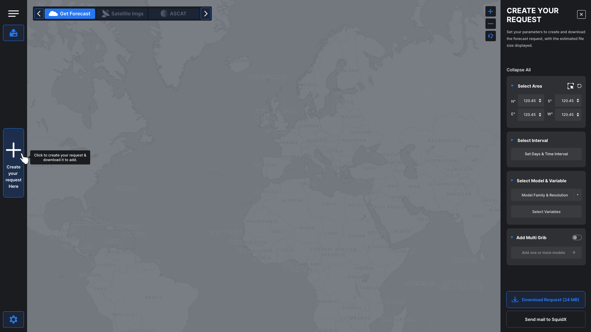
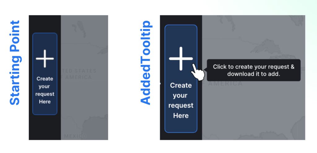
To improve the forecast download request process, creating a clear and intuitive flow with step-by-step guidance is recommended. A clear starting point, such as a prominent ‘Create your request here’ button, can be positioned at the beginning of the process to guide users effectively. Visual cues and tooltips will further assist users, particularly first-time users, in navigating the process with ease.
2. Add Tooltips
Implementing tooltips for key elements and actions throughout the interface is recommended. These tooltips should provide brief, contextual explanations or instructions when users hover over or interact with specific fields or buttons.
3. Improve Map Interaction
To make map interactions more intuitive, adding a dedicated “Select Area” button will allow users to easily create a new selection rather than adjusting a pre-set region. Simplifying the map controls with more flexible options will improve the user experience and help users complete tasks more efficiently without unnecessary delays.
4. Reduce Cognitive Overload
To minimize cognitive overload, the options should be categorized. This can be achieved through clear sections, collapsible menus, or a progressive disclosure approach where users are presented with only the most relevant options at each stage. This step-by-step interaction will help users feel more in control and aware of what they are doing, creating a cleaner, more efficient interface and preventing them from feeling overwhelmed.
3. UX Process
Overview
The UX improvement process followed a structured, user-centred approach:
- Research and Discovery: Analyzing the current interface and identifying user pain points.
- Problem Definition: Framing the challenges to address.
- Ideation and Wireframing: Proposing improvements to the existing interface and visualizing the solutions.
- Testing and Feedback: Simulating user testing and iterating based on insights.
Research and Discovery
Problem
Definition
Ideation and Wireframing
Testing and
Feedback
4.1 Research & Discovery
Understanding the Users
Skippers in offshore racing require tools that:
- Provide reliable and precise weather data.
- Allow customization of forecasts to suit specific routes and time intervals.
- Enable quick decision-making under challenging conditions.
Competitor Analysis
- For the offshore racing market, PredictWind & Adrena are widely recognized as major players, offering advanced weather routing and forecasting tools that are essential for skippers in races like the Vendée Globe. Although detailed access to their premium features was not available, both platforms are known for their capabilities in providing accurate weather data, performance analysis, and route optimization.
PredictWind is known for its comprehensive wind and weather forecasting, which includes tools for routing and performance analysis. It’s widely used by offshore skippers for its reliability and precision in predicting weather conditions over long distances.
Adrena on the other hand, focuses on advanced navigation and weather routing, with an emphasis on performance optimization for skippers. It is recognized for its integration with GPS and AIS systems, helping skippers track their position and adjust routes in real-time based on changing weather conditions.

Analyzing the Current Interface
An analysis of the existing interface revealed the following issues:
The evaluation of the existing SquidX interface revealed several usability challenges, particularly in initiating and completing the forecast download process. The absence of a clear starting point made it difficult for users to navigate the workflow efficiently. Additionally, interactions with map tools and the overall clarity of information were identified as areas needing improvement.
User Pain Points
Confusing Workflow: Unclear starting points make it difficult to begin the forecast download request, leading to delays and confusion.
Lack of Guidance: The absence of tooltips and contextual help leaves users uncertain about field functions, increasing cognitive load.
Inefficient Map Interaction: Adjusting pre-set selections is time-consuming, instead of easily creating new ones, reducing task efficiency.
Unclear Feedback and Labels: File size information and vague labels cause uncertainty, not clearly guiding users on the next steps.
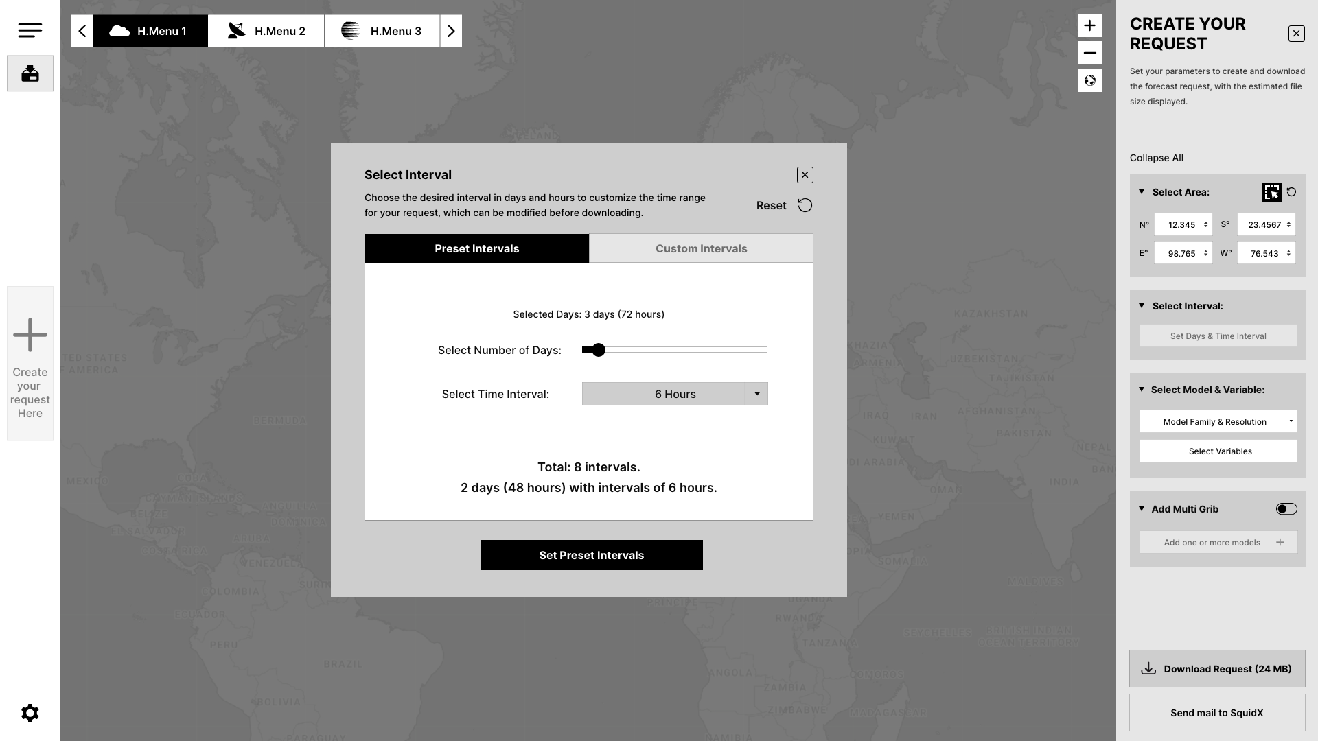
Unclear Time Interval Selection: Time intervals are not grouped. Clicking “Show More” reveals a long list of hours as checkboxes without any filtering or organization, leading to excessive scrolling. This makes selecting the right intervals confusing and inefficient.
Uncategorized Variable Selection: Variables are presented as a long, ungrouped list with toggle switches, causing excessive scrolling. The lack of categorization makes finding and selecting relevant variables more complicated and time-consuming.
Overwhelming Options: A large number of visible options at once overwhelms users. Without clear categorization or prioritization, users struggle to focus on the most important tasks, which can lead to disengagement or task abandonment.
4.2 Problem Statement
How might we optimize the existing SquidX interface to create a more intuitive and efficient experience for skippers, enabling them to download weather forecasts and plan routes with ease?
4.3 Ideation
UX Improvements: Design Goals & Conceptual Exploration
Design Goals:
Simplify the Workflow
Create a clear and intuitive process for skippers to initiate and complete forecast download requests, reducing confusion and delays.
Enhance User Guidance
Incorporate contextual help, such as tooltips and visual cues, to assist users in understanding field functions and actions, minimizing cognitive load.
Improve Map Interactions
Enable users to interact with the map effortlessly by introducing features like a dedicated “Select Area” button and flexible controls for creating and saving regions.
Clarify Feedback and Labels
Ensure that feedback, such as file size information, is prominently displayed and labels are precise and action- oriented, guiding users seamlessly through tasks.
Simplify Time Interval Selection
Group and categorize time intervals into preset and custom options, reducing the need for excessive scrolling and making the selection process more efficient and intuitive.
Enhance Variable Selection
Categorize variables into logical groups, allowing users to toggle between options easily. This will reduce the time spent scrolling and ensure users can quickly find and select relevant variables.
Streamline the Interface :
Reduce visual clutter by grouping and prioritizing options, making the interface more approachable and efficient for both new and experienced users.
Conceptual Exploration:
Streamlined Workflow Design
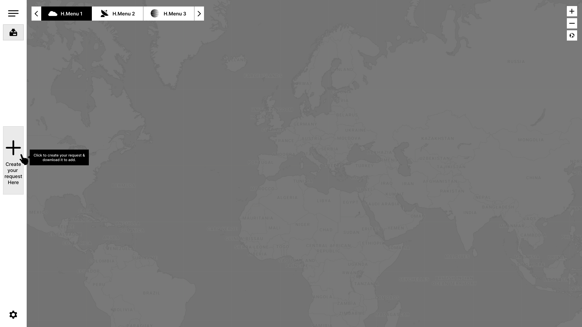
- Introducing a prominent “Start New Request” button to guide users directly into the forecast download process.
- Designing a step-by-step progression that minimizes ambiguity and ensures clarity at each stage.
- Categorizing the forecast download request panel into distinct steps, making the process more organized and easier to follow.
Enhanced Map Interaction
Prototyping a dedicated “Select Area” button for intuitive region selection.
Time Interval and Variable Selection Button State Change
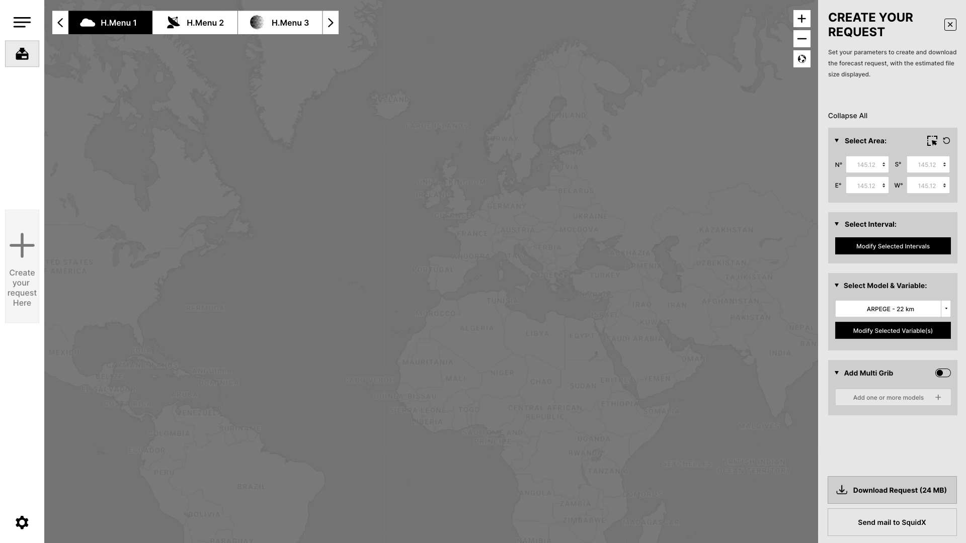
Introducing a dynamic state change for the “Select Interval” and “Select Variable” buttons. Once an interval and variable are set, the button changes to “Modify” to indicate that the user can adjust the selection before downloading, offering a clear visual cue of the current state.
Guidance Through Tooltips and Visual Cues
Conceptualizing tooltips that appear contextually when users hover over fields or actions, offering immediate assistance.
Improved Feedback Mechanisms
- Reimagining the placement of feedback, such as file size information, to ensure it is visible and contextually relevant.
- Refining labels to clearly communicate the purpose and action associated with each option.
Simplified Interface Layout
Exploring layouts that group related options together, reducing cognitive overload.
Key Features in the Improved Interface
The improved interface introduces several key features designed to enhance usability, streamline workflows, and provide clear guidance throughout the forecast download request process. These features aim to address the identified pain points and align with the design goals:
Clear Starting Point
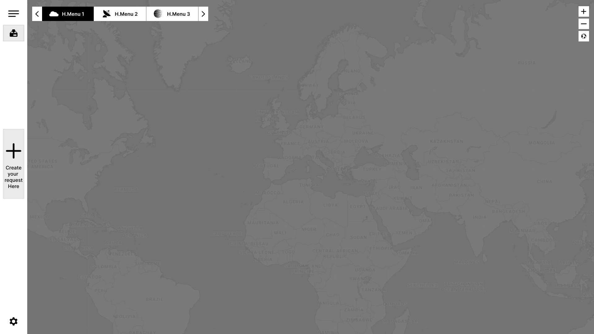
A prominent “Create Your Request Here” button is introduced at the beginning of the process, offering users a clear starting point to initiate the forecast download request with ease.
Step-by-Step Process Flow
The forecast download request is divided into clearly defined stages, guiding users through each step with minimal effort and reducing confusion.
Intuitive Map Interaction
A dedicated “Select Area” button allows users to easily select new regions, eliminating the need to adjust pre-set selections.
Tooltips and Contextual Help
Tooltips appear when users hover over interactive elements, providing brief and clear explanations of fields and actions. Visual cues such as icons and color highlights are used to direct attention to critical elements, enhancing user understanding.
Enhanced Feedback Visibility
File size information and other feedback are prominently displayed within the request section, ensuring that users can easily access relevant details. Clear, descriptive labels replace vague terms like “New Request” to improve clarity and guide users toward the next action.
Error Prevention and Clarity
Clear instructions and labels reduce ambiguity, helping users avoid mistakes and ensuring a smoother experience throughout the request process.
5. Wireframing
High-fidelity Wireframes


6. User Testing
Testing and Feedback
Objective
The goal of this testing phase was to validate the effectiveness of the proposed UX improvements in addressing the identified pain points. The focus was on ensuring that the interface enhancements were intuitive, efficient, and aligned with the needs of offshore skippers.
Proposed Testing Plan
While live user testing was not conducted with a larger group, a structured validation approach was followed to evaluate the proposed improvements. The plan included the following key elements:
Methodology
- Type of Testing: Moderated usability testing with one real user (a skipper).
- Participant: One skipper, representing an intermediate level of expertise.
- Testing Format: Remote usability testing session using screen-sharing tools. The participant was asked to think aloud while completing tasks on the new wireframe, and the current app was also shown for comparison, with screenshots provided for context.
Tasks for User Testing
Please complete the following tasks to help us evaluate the improved interface:
Start a New Request
Click the “+” button to initiate a new forecast download request.
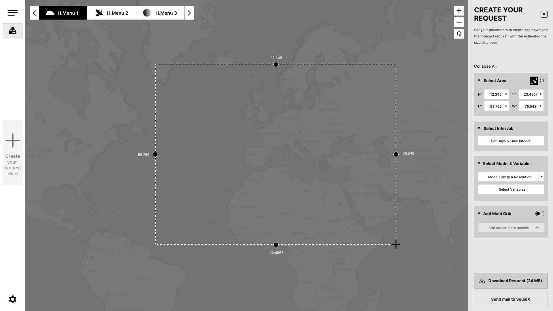
Select an Area on the Map
Use the “Select Area” icon to choose a region on the map. Afterward, please try using the “Reset” option to clear your selected area.
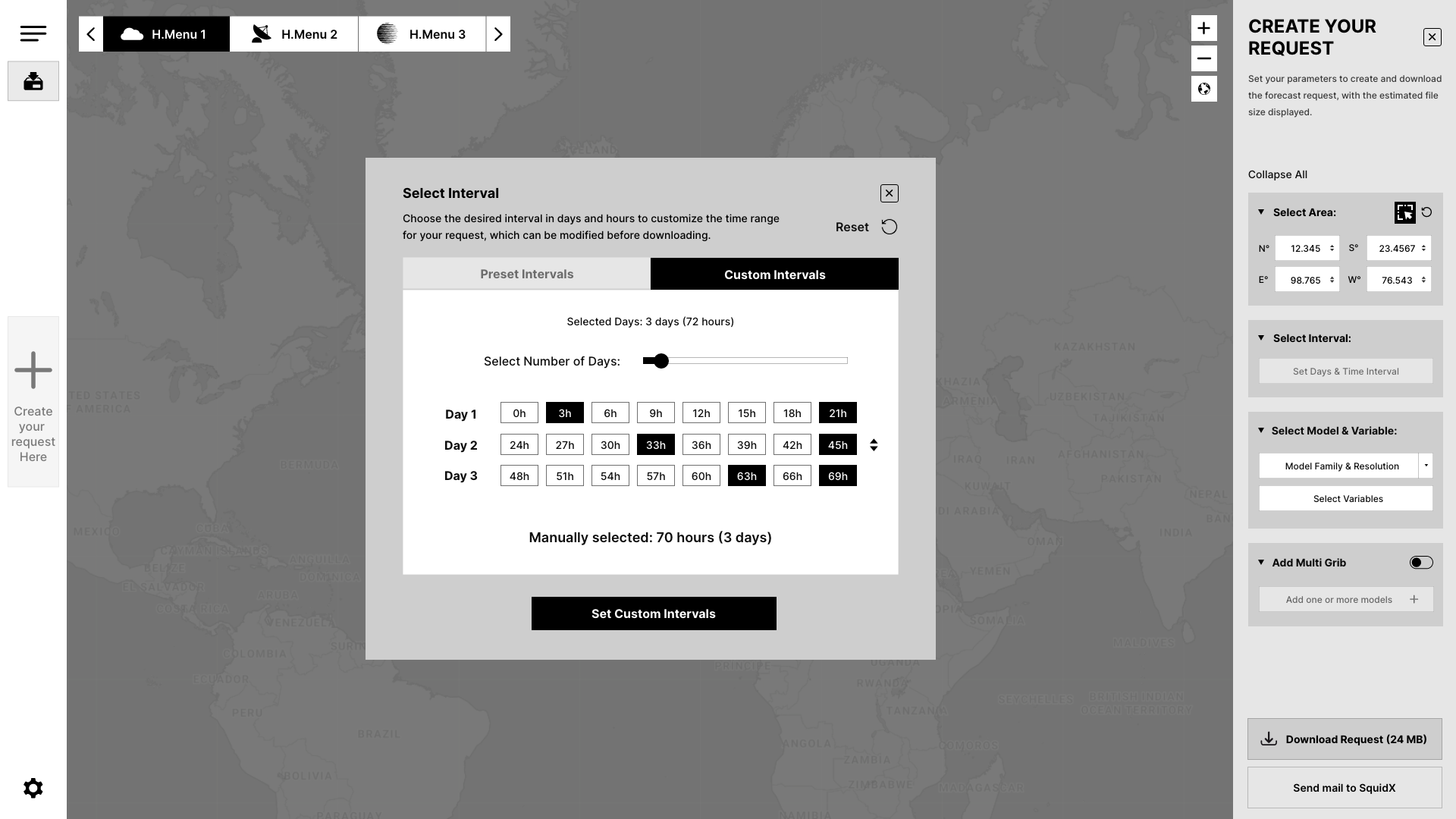
Select Time Intervals
Click the “Time Interval” button to open a modal with preset and custom interval options. After selecting your desired interval, click “Set Interval” to confirm. Notice that the button state changes to “Modify,” allowing you to adjust the interval before downloading.
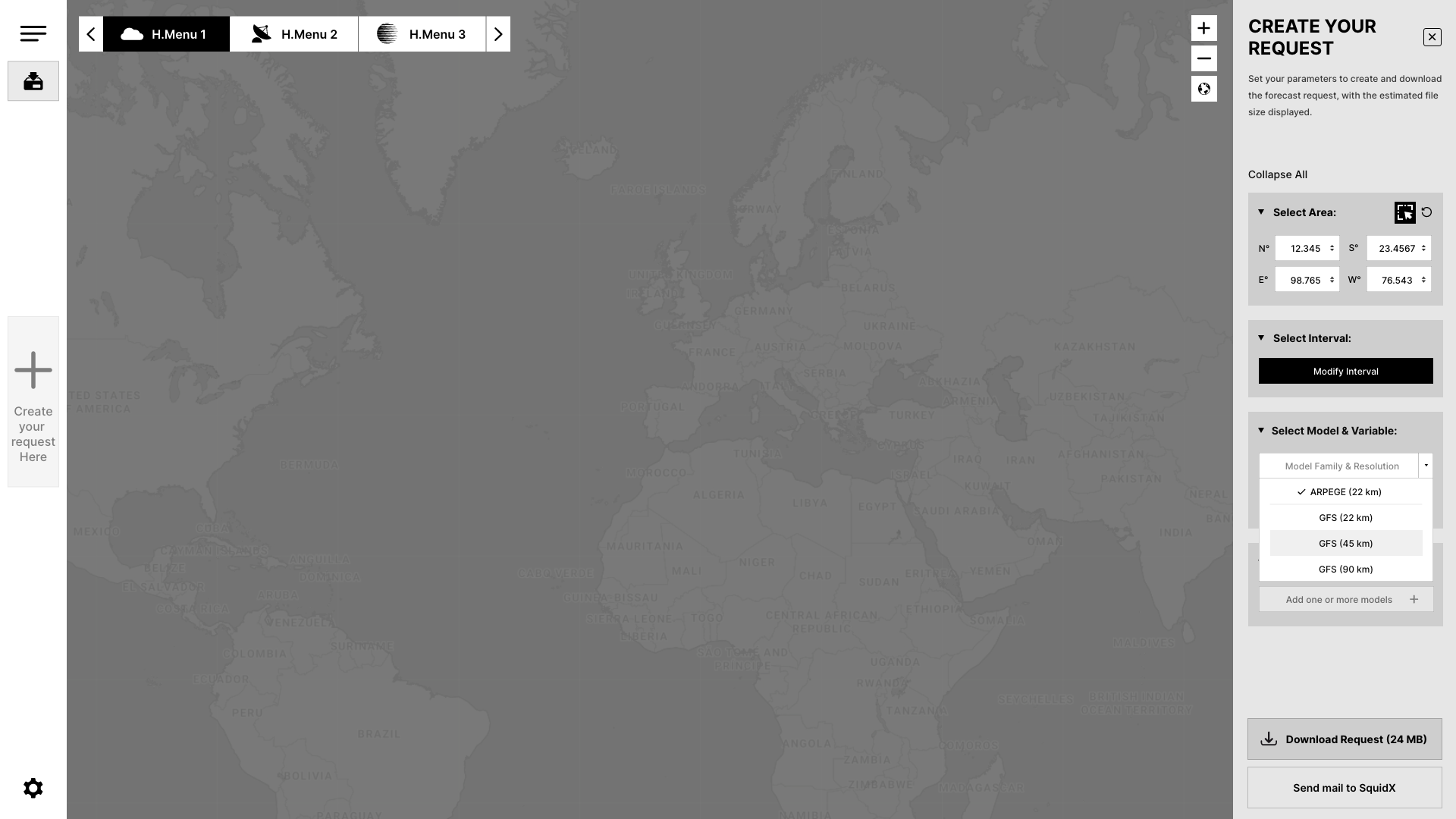
Select Variables
From the dropdown, choose the model family, and then select the variables. A popup will appear with toggle switches for the variables. Once you’ve made your selections, click “Set Variable” to confirm. Notice that the button state changes to “Modify,” allowing you to adjust the variables before downloading.
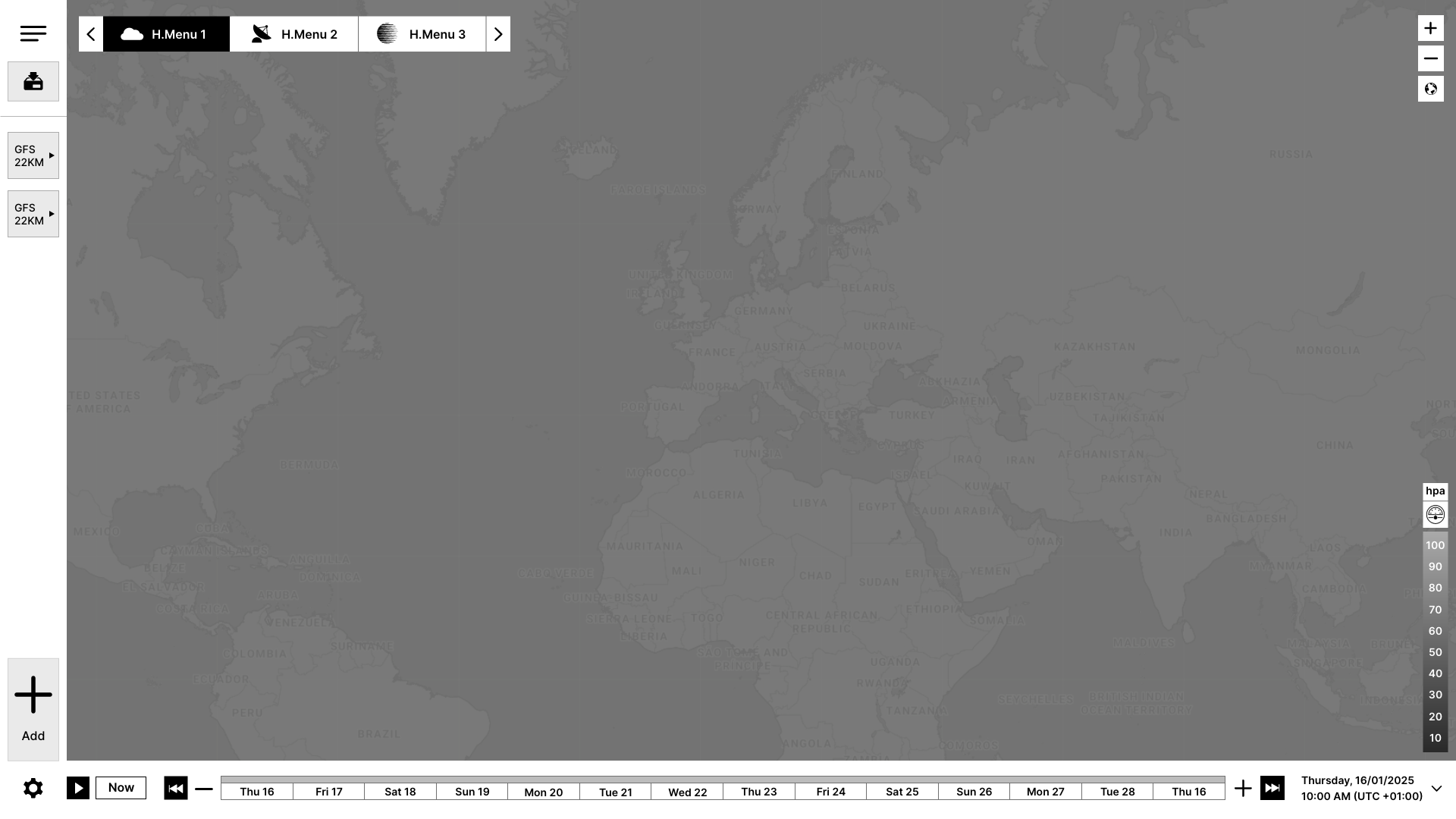
Download the Forecast
The tester found the “Download” button to be clearly visible and understood that it was the final step in the process. The download process was smooth and without confusion, and the tester felt confident in completing the task without any issues.
Feedback from Tester
Start a New Request
The tester found the “+” button to be easily accessible and intuitive for initiating a new forecast download request. They did not experience any confusion about how to begin the process, and the action felt straightforward.
Select an Area on the Map
The tester reported that the “Select Area” icon was easy to find and use. The click-and-drag functionality for selecting the region was intuitive and faster than manually inputting coordinates. The reset function worked as expected, allowing them to clear the selected area. The visual highlight of the selected area was appreciated, as it provided immediate confirmation and minimized errors.
Select Time Intervals
The tester found the “Time Interval” button easy to locate, and the modal screen for selecting preset and custom intervals was clear and user-friendly. After selecting the desired interval, they easily clicked the “Set Interval” button to confirm. They noticed the button state changed to “Modify,” which reassured them that they could make adjustments before proceeding with the download.
Select Variables
The tester was able to easily select the model family from the dropdown and toggle between variables. The popup for selecting variables was intuitive, and the “Set Variable” button was easy to find for confirming the selection. They also noticed the button state changed to “Modify,” which reinforced the ability to modify the selection before downloading.
Download the Forecast
The tester found the “Download” button to be clearly visible and understood that it was the final step in the process. The download process was smooth and without confusion, and the tester felt confident in completing the task without any issues.
Potential Areas for Improvement
Onboarding for New Users
While the interface was generally intuitive, the tester, as an intermediate user, suggested that novice users might benefit from additional guidance. A brief tutorial or onboarding walkthrough could help first-time users better understand the core features and navigation, reducing any initial confusion.
8. Conclusion
The proposed UX improvements aim to create a more intuitive and efficient experience for offshore skippers using SquidX. By simplifying the workflow, enhancing map interaction, providing real-time feedback, and reducing cognitive load, the redesigned interface addresses key pain points and enhances the overall user experience.
Download my CV
Your insight into my career and capabilities.